Vellum & Vine builds identities for premium consumer brands — beginning with the words, then the type, then everything the eye reaches after.
Most studios draw a mark and write the copy to fit it. We work the other way around: a brand's voice and its typography are decided together, in the first week, because they are the same decision.
Every engagement opens the same way — with reading. The old copy, the founder's emails, the words customers use without being asked. A brand already has a voice; most of the time nobody has written it down.
From that we set the typographic palette and the language in the same pass, because a typeface is an argument about tone and a sentence is an argument about tone, and they have to agree. Only then does form follow — the mark, the colour, the system.
We keep the studio small on purpose. Four people, no juniors handed the difficult page. The person who reads your brief is the person who sets the last line of your packaging.
Four disciplines, one continuous argument.
Brand Identity
Name, voice, logotype, and the typographic system beneath them.
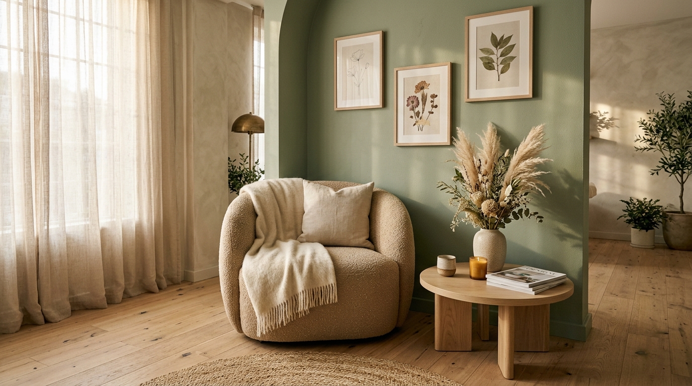
Brands we have set in type.


Read, write, set, release.
Read
We begin with everything the brand already has — old copy, founder notes, the words customers use unprompted. The voice is usually there; it has just never been written down.
Write
Naming, voice, and the verbal system come before form. A brand that cannot describe itself in a sentence cannot be designed into one.
Set
Typography and identity are decided in the same pass. The typeface and the sentence are arguments about the same tone, so they are settled together.
Release
Packaging, art direction, and editorial work carry the system into the world — and a written book hands it to whoever maintains the brand next.
Tell us what you are building. We will tell you, plainly, whether we are the studio for it.