
Brand identity · Packaging2025
Identity for a Douro wine estate
A heritage estate renaming three generations of wine under one typographic mark.
A representative selection across disciplines. Each began the same way — with reading, then writing, then form. Project detail is shared on request.
A heritage estate renaming three generations of wine under one typographic mark.

A bar wrapper designed as a short essay on the cacao's origin — read on the unfold.

A grid and type system flexible enough to outlast a rotating cast of guest editors.
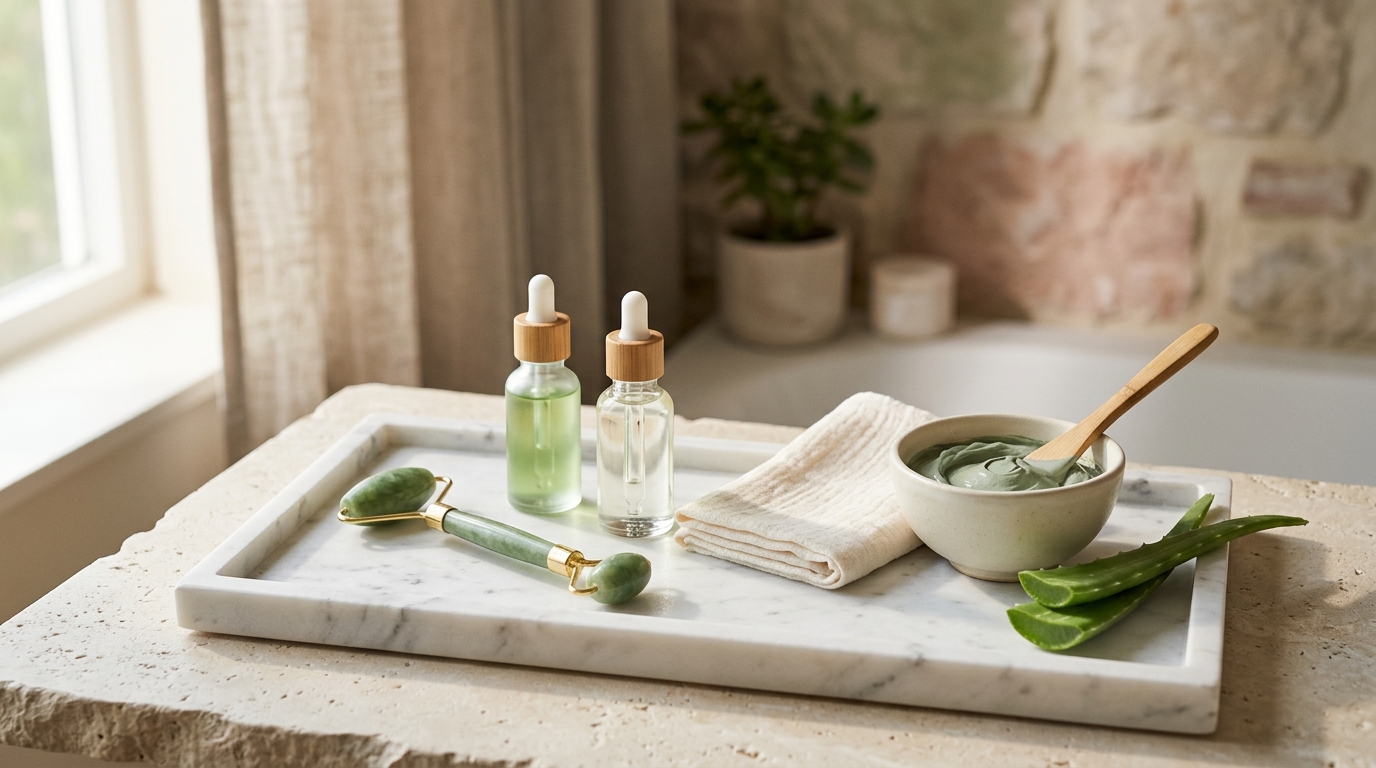
A photographic language for scent — light and distance standing in for the unphotographable.

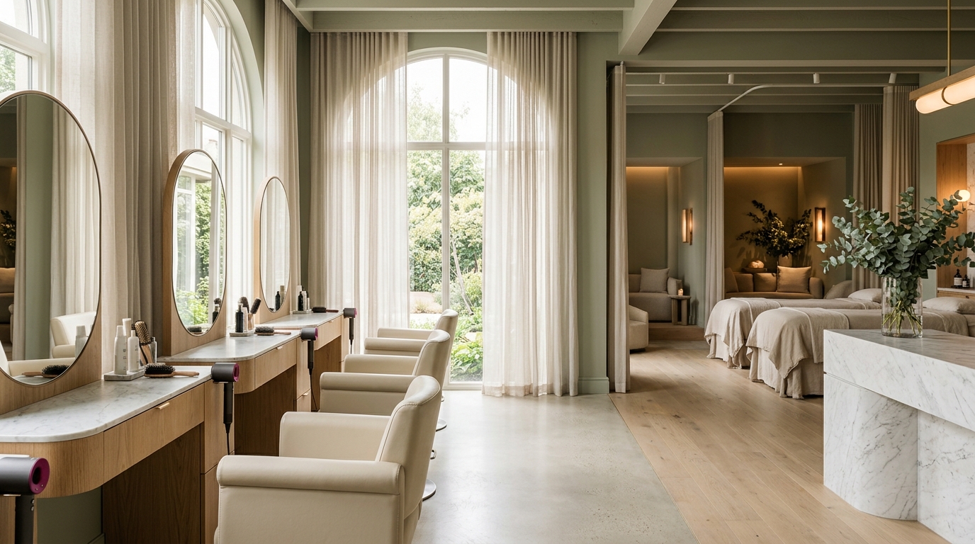
A name and logotype for a studio whose work was already quiet, confident, and unhurried.
A label that treats provenance as the headline and the harvest date as the proof.